


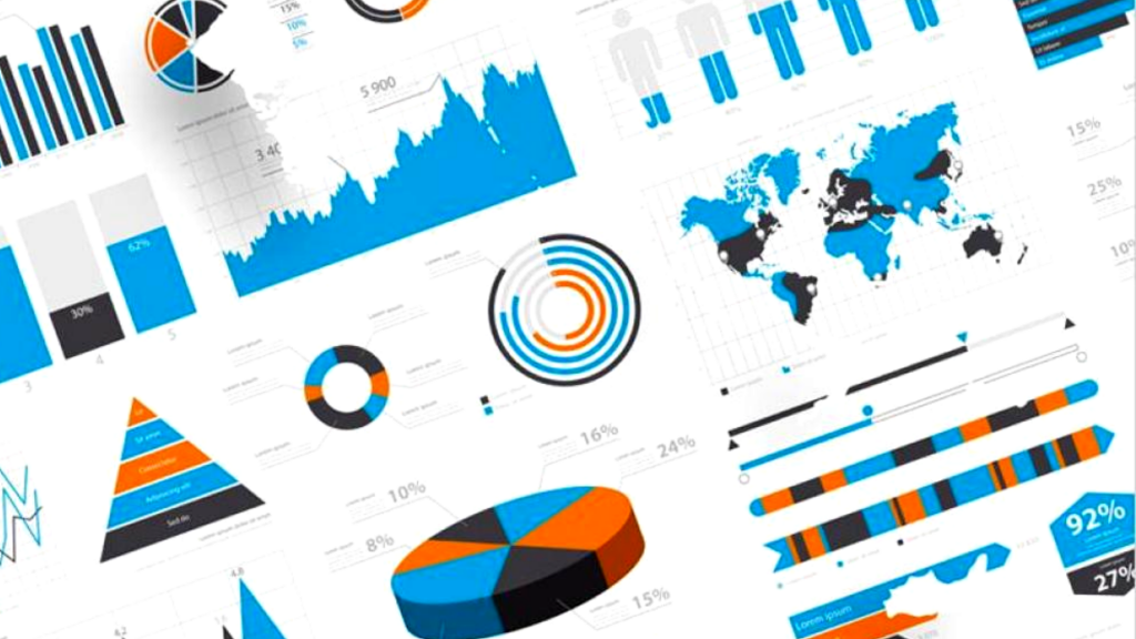
Consider yourself lucky to be on this blog if you don?t know how important data visualization is just yet. However, if you work with varieties of data regularly, you will need to understand how data visualization works to take your working process to the next level. There are number of different visualizations available online like Sankey Diagram, Radar Chart, Pie Chart, Bar Chart, Line Chart, Slope Charts, Likert Chart etc. and you must know which will be best for representation of your data.
Think of it this way; man has been wired to be more attracted to diagrams, charts, and maps than mere texts. It is pretty easy for men to get bored by bulky texts, especially during presentations. If you want to get men?s attention, representing information in the form of charts or plots will get them on the same page as you are.
You are on the best blog if you want to find out what data visualization is. We will check out the definition, benefits, and examples in this age. However, you may need to continue reading to find out all you need to know.
Data Visualization: Definition
Let?s put it straight and simple; data visualization is the process of representing an effective form of information in the form of diagrams, pictures, charts, maps, etc. Data visualization is usually used to report large amounts of data to make information more easily identifiable and understandable.
This best way to part information across to a large gathering of people in recent age, especially on the internet, is through data visualization. But, if you have a large metric of data, people will easily get bored. Have you found out that people of this age find it difficult to read the bulk of texts patiently? The best way to get them is to show them the easy way out; data visualization.
If you want to make data-driven decisions in this technology age, you will need to analyze massive amounts of data through data visualization. It will help your business and your working place.
If you wonder whether data visualization will work for you, understand that it works efficiently for all fields, including medicine, law, engineering, statistics, and business. No one is left out. For example, if you are making a presentation concerning covid-19, you may need to use bar charts to represent information by comparing the breakout of the virus between 2020 and 2021.
Benefits of Data Visualization
As I have pointed out earlier, human beings are easily attracted to patterns, colors, diagrams, and pictures. We tend to be more attracted to graphics than raw texts, and we quickly find it easy to differentiate between blue and red or squares and circles. This is major because we have a visual sense of understanding, and it is easier to get our interest this way to ensure we keep our eyes on the information.
Let?s check below for some of the benefits of using data visualization;
1. Good Story-Telling Ability:
Data visualization helps you tell a good story without explaining much to the audience what you mean. People tend to interpret information from charts easily than from the bulk of texts that is usually noise-oriented. If you can get your plots, maps, or diagrams to convey the appropriate message, you may have been able to pass across your information quickly.
2. It is Quick and Easy to Understand:
Data visualization uncovers insights from complex data sets without needing a data scientist to explain the information to a general audience.
3. Data-driven decision-making:
Another advantage of using data visualization is that you will make decisions based on data since you can interpret the information quite easily. Instead of basing decisions on mere feelings, data visualization sets you on the right track to make the best decision for your project.
Examples of Data Visualization
The first thing that may come into your mind whenever you think of data visualization could be pie charts or bar charts. However, it goes beyond that. There are tables, infographics, scatterplots, maps, dashboards, and graphs, etc.
If you want us to be more specific, we have the following examples;
- The Sankey Diagram
- Word Cloud
- Wedge Stack Graph
- Treemap
- Text Tables
- Streamgraph
- 2D or 3D Scatter Plot
- Radial Tree
- Polar Area
- Matrix
- Histogram
- Highlight Table
- Heat Map
- Gantt Chart
- Dot Distribution Map
- Circle View
- Bullet Graph
- Bubble Cloud
- Cartogram
- Box-and-whisker Plots
- Bar Chart
- Area Chart
- Pie Chart
- Pareto Chart
- Radar Chart, etc.
Before you display the data visualization of your choice, you need data presentation tools like the Likert scale, among others, to ensure you can effectively analyze your data.
Conclusion
Let?s say you are new to data visualization; after finding out so much information on this blog about data visualization, you have no reason not to start using it to make better decisions concerning your business.
Before you proceed into that business meeting, you should consider representing the bulk of information you have into charts, maps, and graphs to make sure your audience has an easy grasp of what you want them to understand. If you are yet to read this blog, get to it!

As the editor of the blog, She curate insightful content that sparks curiosity and fosters learning. With a passion for storytelling and a keen eye for detail, she strive to bring diverse perspectives and engaging narratives to readers, ensuring every piece informs, inspires, and enriches.


