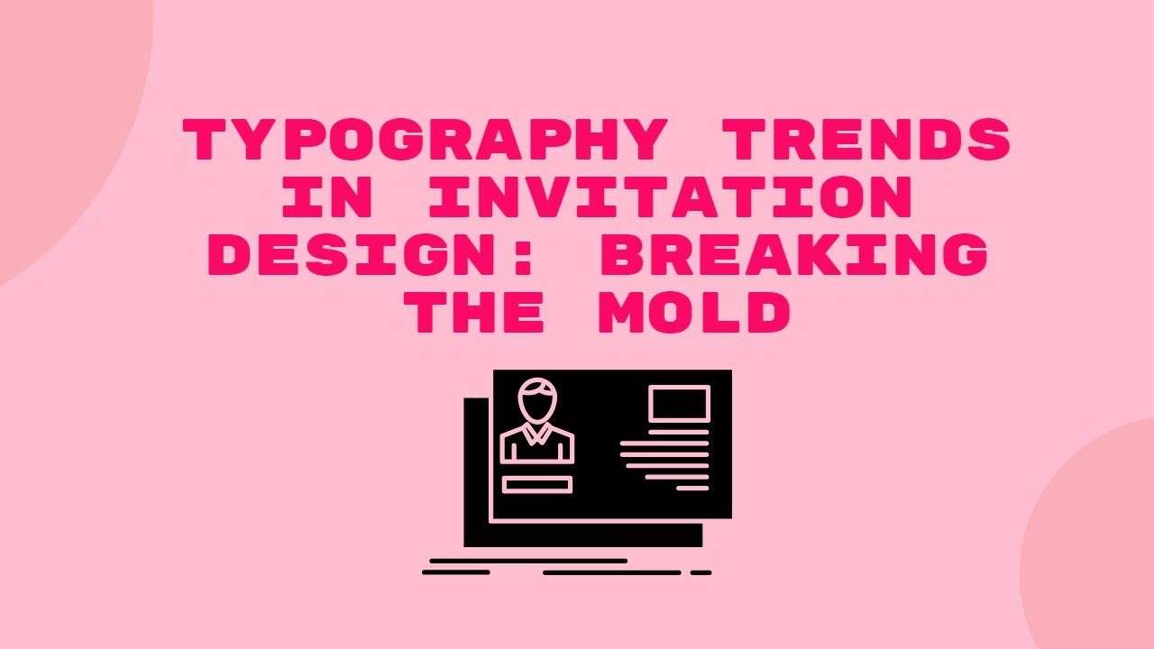
Typography plays a pivotal role in the world of invitation design, often serving as the first interaction between an event and its attendees. In this article, we’ll delve into the captivating realm of Typography Trends in Invitation Design, exploring how designers are breaking the mold to create visually stunning and memorable invitations. Whether it’s experimenting with bold fonts, elegant scripts, or innovative layouts, the invitation creator becomes an essential tool for crafting unique and personalized designs that set the tone for unforgettable events.
Introduction
Typography, the art of arranging text in a visually appealing and readable manner, is a crucial element in invitation design. Whether it’s for a wedding, a birthday party, or a corporate event, the right choice of fonts can set the tone and convey the essence of the occasion.
Historical Perspective
As we journey through the evolution of typography in invitations, we discover iconic styles that have shaped the way we perceive and celebrate events. From classic serif fonts to extravagant calligraphy, the history of invitation typography is rich and diverse.
Current Trends in Typography
In today’s design landscape, minimalistic typography is gaining popularity. Clean lines and simple fonts exude elegance and modernity. Additionally, handwritten fonts are making a comeback, bringing a personal touch to invitations. Bold and playful styles are also on the rise, adding a touch of creativity and uniqueness.
Breaking the Mold
Designers are pushing the boundaries of traditional typography, adopting innovative techniques and unconventional font pairings. This section will explore how breaking away from the norm can result in invitations that stand out and leave a lasting impression.
Importance of Typography in Invitation Design
The significance of typography goes beyond aesthetics. It helps in setting the tone for the event and enhancing the overall theme and mood. Choosing the right fonts can create anticipation and excitement among the invitees.
Choosing the Right Fonts
Selecting appropriate fonts involves considering the type of event and ensuring a harmonious match with visual elements. Whether it’s a formal gala or a whimsical birthday party, the fonts chosen should align with the intended atmosphere.
Tips for Effective Typography
Consistency in font choices throughout the invitation is key to creating a cohesive design. Legibility is another crucial factor; no matter how artistic the font, it must be easily readable to convey the necessary information.
Case Studies
This section will showcase real-life examples of successful invitation designs that masterfully incorporate typography. By analyzing these cases, readers can gain insights into the effective use of fonts in different contexts.
Tools for Typography in Design
For aspiring designers or those looking to enhance their typography skills, this section will highlight popular software and online resources dedicated to typography. From font pairing tools to inspirational websites, there’s a plethora of resources available.
Future Typography Trends
As we look ahead, emerging styles in invitation design and the influence of technology on typography will shape the future. Stay tuned to discover what’s on the horizon for the world of invitation typography.
Engaging the Reader
Typography isn’t just about letters on a page; it’s a storytelling tool. Learn how designers use fonts to weave narratives and create emotional connections between the event and its attendees.
DIY Typography Tips
For the do-it-yourself enthusiasts, this section provides simple and budget-friendly tips for experimenting with typography. Even without professional design skills, anyone can add a personal touch to their invitations.
Common Typography Mistakes to Avoid
Amidst the quest for creativity, some pitfalls can hinder the effectiveness of typography. This section will highlight common mistakes to steer clear of, ensuring your invitation remains visually appealing and informative.
The Impact of Color on Typography
Understanding the psychology of color in font choices is essential. This section explores how different colors can evoke specific emotions and how to harmonize typography with overall color schemes.
Conclusion
In conclusion, the world of typography in invitation design is dynamic and ever-evolving. By embracing trends, learning from historical styles, and experimenting with creativity, designers can elevate their invitations to memorable works of art.
FAQs
- Q: Can I use multiple fonts in one invitation?
- A: While it’s possible, it’s crucial to maintain harmony. Too many fonts can lead to a cluttered and confusing design.
- Q: Are handwritten fonts suitable for formal events?
- A: Handwritten fonts can add a personal touch, but they might be more appropriate for casual or themed events.
- Q: How do I choose the right font color for my invitation?
- A: Consider the event theme and the emotion you want to convey. Darker colors for formality, lighter for a more relaxed vibe.
- Q: Are there free resources for experimenting with fonts?
- A: Yes, numerous websites offer free font downloads and pairing suggestions for designers on a budget.
- Q: Can I create professional-looking invitations without design experience?
- A: Absolutely! DIY tips and user-friendly software can help you craft visually appealing invitations even without extensive design skills.